
- Features
- Solutions
- Pricing
- Resources
- Contact
- Book a demo

Spacebring helps bring your shared space to people. We are a value-driven company with a vision to increase the value of the shared space economy. To embody our commitment to guide shared spaces to success through the magic of cutting-edge technology, we have partnered with gram, a renowned Ukrainian design agency, to create a new brand identity that reflects Spacebring's values and vision.
Our transition to Spacebring reflects our unwavering commitment to efficiency and openness. It's not just about a new name; it's about embracing a mindset of constant improvement and empowerment within our community.Olena Bibik-FlysSpacebring CMO
A Fresh Perspective
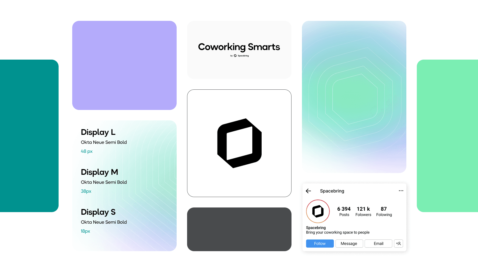
Spacebring’s new design language represents a significant step forward. From logos to color palettes, every design element has been carefully crafted to project our values, vision, and mission.
Logo: Unity in Motion
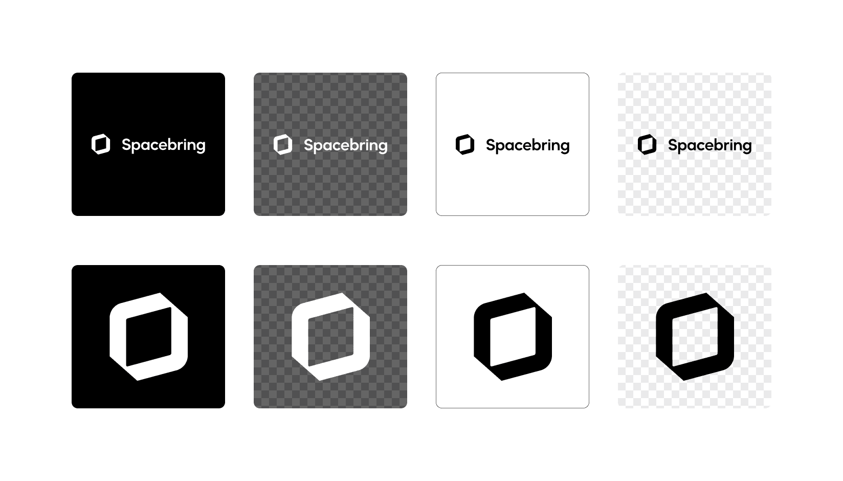
Our new logo represents the cornerstone of our rebranding effort. It is a symbol of unity and shared spaces in their evolution. The isometry of a shared space cube, which is our central motif, embodies the essence of shared spaces—flexibility and openness. From different angles, it conveys movement and growth, reflecting the value of our product that accelerates opportunities for shared spaces. The two arrows that form the cube represent expansion and the pursuit of new opportunities.
Colors: Guide & Magic
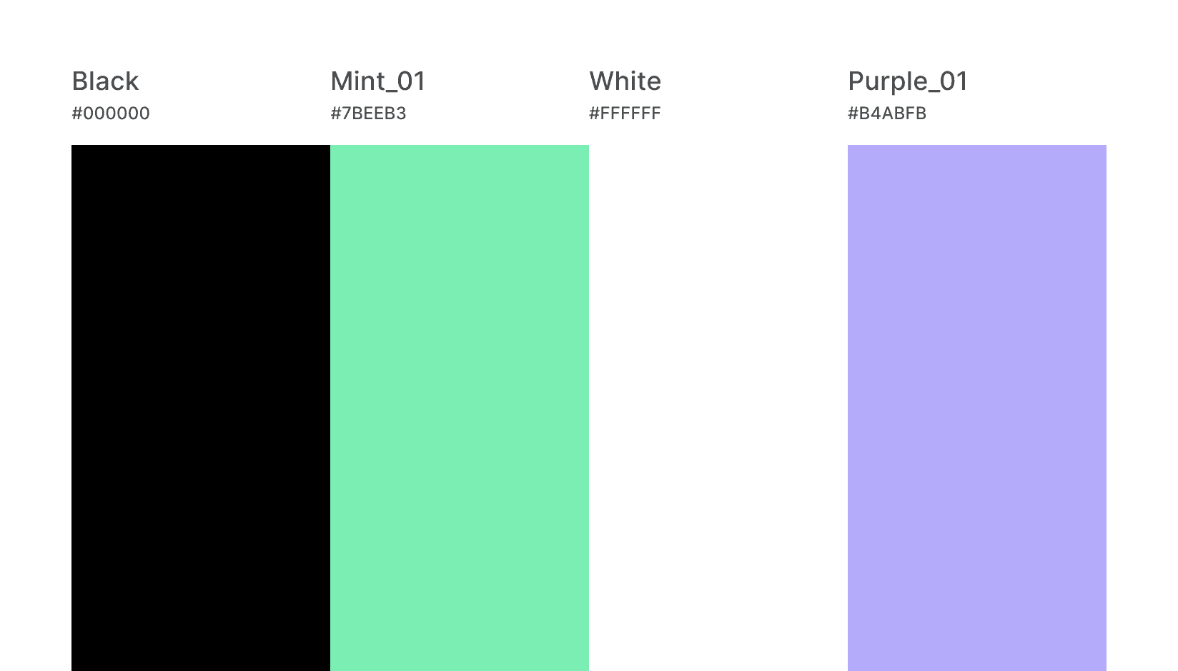
Our color palette embodies our values by combining the foundation of our industry-leading guidance and support with the magic of modern technology. The Spacemint represents our platform's emphasis on generating sustainable revenue for shared space businesses, providing reliable industry-leading guidance and customer care. The Spacepurple adds a touch of enchantment that technology brings to save you time, increase efficiency and excite customers. The Spaceblack and Spacewhite provide a timeless backdrop, ensuring versatility across all platforms.
Design: a Cohesive Experience
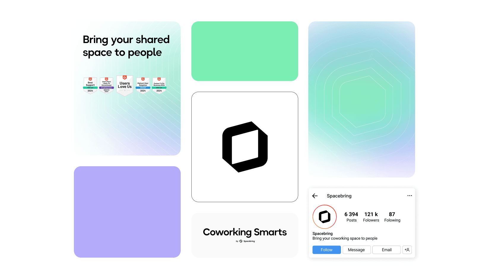
In addition to the logo and colors, our design elements including gradients, patterns, shapes, and typesets work together to create a dynamic and cohesive brand. The gradient emphasizes key information, while the pattern adds visual interest.
Partnering with Spacebring was an inspiring experience. Together, we sought to capture the essence of their vision and translate it into a dynamic visual identity that resonates with audiences worldwide.gram family
Explore Spacebring
As we embark on this transformative journey, we invite you to explore Spacebring and join us in increasing the value of the shared space economy. Explore our new brand guidelines and visit our website to learn more about Spacebring.
Keep Reading


Get inspiring coworking stories in your mailbox
Sign Up for Our Newsletter
